Thank you for visiting!
About /
Information
Contact /
julesjulien[a]mac.com
Stay in touch /
Instagram
07.05.2024 —

New personal work:
Gray Area
Gray Area is a new work of monochromatic digital drawings created around the gray hue like a broad faded palette. The theme evokes the phantasmagoric charge of certain pieces of clothing or accessories. Like a second skin, they dissolve into their shadow our natural identity to enrich it with their own. Desired duplicity that allows us to escape from our human condition. A double game with no rules that transports us into an augmented reality made of hybrid personalities.
Prints on Hight Reflexion 250gr Fuji - Alu Flush Frame and Acrylic Mounted Print. 63 cm x 83 cm, limited edition of 10. /
12.01.2024 —
New limited edition of prints available
at Julien Rademarker’s gallery
A fresh collection of limited-edition prints, each produced in a run of only 15 copies, is now accessible at Bisou Gallery in Amsterdam. These prints showcase selections from my series Frères Ennemis (2017) and Maigres Mirages (2020). They are high-quality artprints on Bright White Hahnemühle 310gsm paper, 34 cm x 44 cm. The prints are available for purchase either unframed or framed with clarity glass. /
view here
31.12.2023 —

Portrait of Frank Haasnoot
for his new book WHIP
Excited to be part of the just-launched new book by Frank Haasnoot, Whip. Whip showcases the creative process with a dynamic and seductive collection of 50 focused prints on 436 pages, covering pastries, chocolates, ice-cream, travel cakes, and much more. Collaborating with him and the agency Offff based in Rotterdam, I have created a monochromatic portrait of him in line with my personal series Red Glow. Thank you, Frank and Maarten, for including me in your book project! /
31.10.2023 —

Editorial illustrations on Halloween
for The New York Times for Kids
Nice to be part of The New York Times Kids' special Halloween issue named The Unknown. I have created a monochromatic blue series of creatures that inhabit the depths of the ocean. They are featured on the central spread of the issue with the text What Lurks Below, written by Kate Golembiewski. Thank you to Fernanda Didini and Deb Bishop for this scary commission! /
01.09.2023 —

Artworks available now
at Julien Rademaker’s gallery
Glad to join the artists roster of Julien Rademaker’s gallery. Bisou Gallery Amsterdam offers a vivid selection of modern art, both from contemporary artists and great artists from the past. After 10 years living and working in Amsterdam, being part of his gallery makes me feel even more at home in this city. /
view here
16.08.2023 —

Artwork cover for the collector’s edition
of ‘Racine Carrée’ by Stromae
On the occasion of the 10th anniversary of the launch of his album Racine Carrée, Stromae is releasing a deluxe reissue in limited copies (Cd and vinyl). Bold Studio in Brussels who worked on the design and art direction of this collector’s edition invited me to create the artwork cover. Merci beaucoup Olivier Gillard and Vincent Losson at Bold for this collaboration. And thank you Gaëlle Birenbaum at Mosaert. /
30.07.2023 —

Cover story illustration on Covid Origins
for The New York Times magazine
Ben Grandgenett, art director at The New York Times Magazine, invited me to collaborate on a cover story written by David Quammen and named Points of Origin. The text focuses on the ongoing mystery of Covid’s origin. "We still don’t know how the pandemics started. Here’s what we know — and why it matters.” Thank you for this great project Ben! /
21.06.2023 —

New collage project named
Le Grand Vide
I am launching a new project of collages named Le Grand Vide — Fascinated by images, they have always been part of my life. From the illustrated bible on my bedside table to the fashion magazines I accumulated in my childhood bedroom, they were all doors through which I escaped from my isolation in the countryside where I lived. Each image brought elements from the outside world and fed my imagination and my inner fantasies.
Then, from my years of study to my years as an artistic director and then an illustrator, I was led to research, analyze and design images, each of which had a role to play, a message to deliver. Hours, days and weeks of searching - on google, image banks, portfolios - for the image that will embody the message.
Social networks, and Instagram in particular, have further multiplied the quantity of images. Changing their role, their value, their hierarchy. Mixing, blending, puking dispossessed images of their own identity for the sole purpose of guessing our own identity. On my Instagram feed, pizzas, works of art, enticing guys, kittens, landscapes, family photos come together and form an abstract universe of which I am the only subject. A new world in the world. New and intimate poetry, absurd and intrusive, ‘portrait chinois’ where fantasy reveals reality, and vice versa.
A chaos of dispossessed images. A disenchanted mirror. A poetry of emptiness. Un grand vide. /
view here
06.03.2023 —

Cover story illustrations on anorexia
for FT Weekend magazine
Financial Times invited me to create a series of drawings to accompany an article written by Hannah Kuchler. “Rewired” focuses on hallucinogenic drugs that offer nex hope in the fight against the deadliest psychiatric disorder: Anorexia. The researchers hope that if psychedelics work, they could help change the conversation around anorexia to show that it's much more about "deeper existential issues" than "someone who has stayed too long in the diet”. Thanks to Shannon Gibson for working again with me on a cover story for FT weekend. /
27.02.2023 —
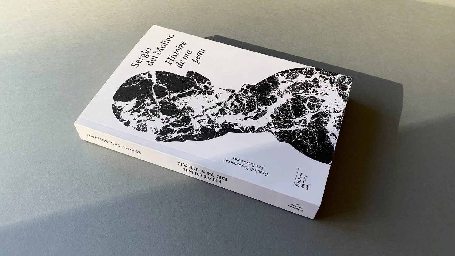
Drawing for Histoire de ma Peau,
a novel by Sergio del Molino
GR20 Paris studio requested to me to feature a personal piece Blackout no.12 to come on the cover of French version of the novel La Piel written by Sergio del Molino and edited in France by Editions de sous-sol. The novel focuses on people with chronic psoriasis, including the author himself. A disease that makes the skin a border with the world. An unclassifiable text on the edge of the essay and the novel, deep and sensitive reflection where the intimate joins the collective. Thanks to Cyriac from studio gr20 and to the author for associating me with this work, a powerful reflection on our human condition. /
21.01.2023 —
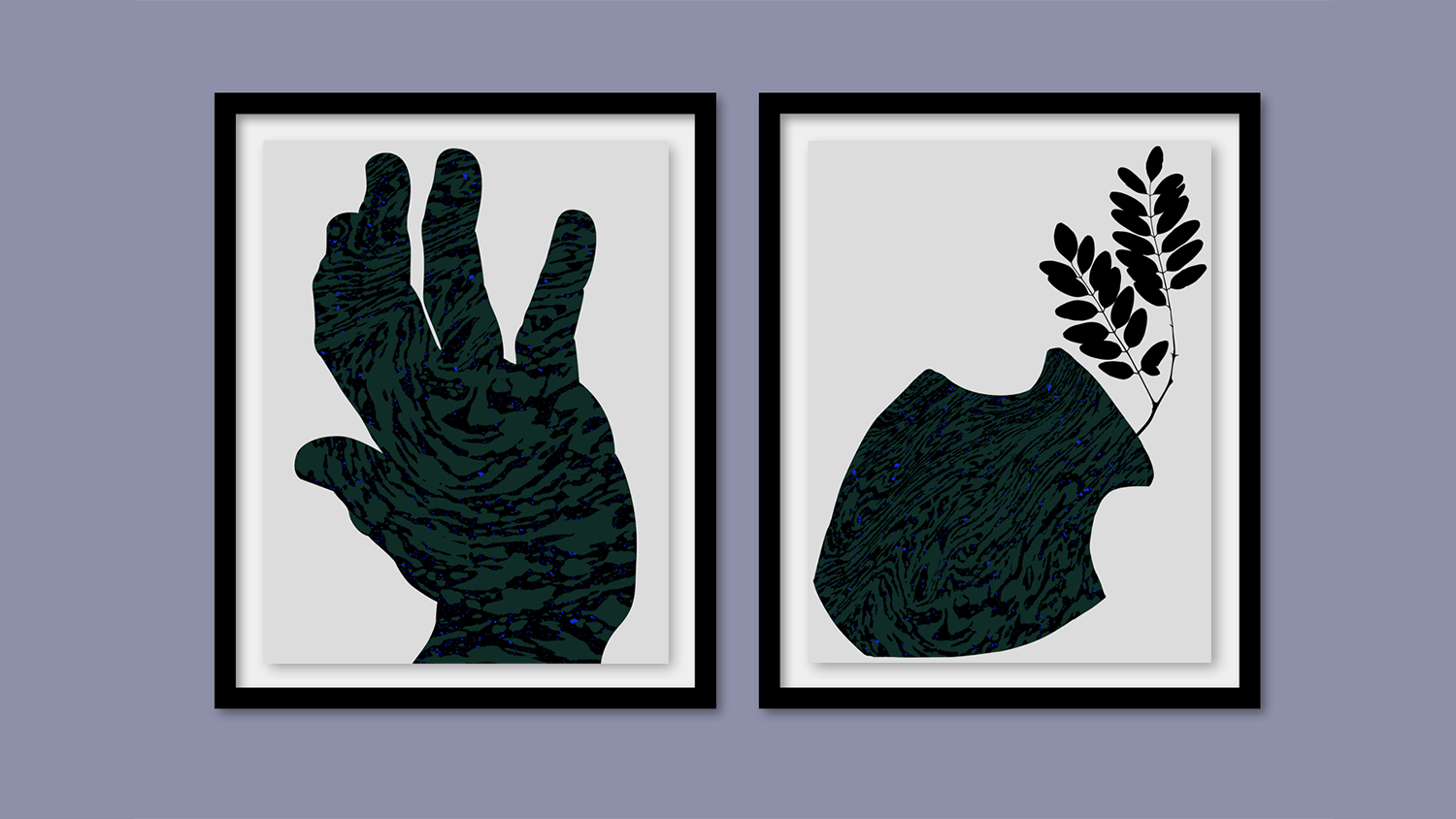
New personal work named Gray Area
Starting the year working on a new personal series of digital drawings named Gray Area. The series focuses on gray color and the ambiguity it conveys. I recently heard Jean-Charles de Castelbajac talking on the radio about dove gray and its use in the luxury industry or the business class of boeings for example. He contrasted the color gray with the usual range of bright colors he uses in his designs. For me, gray is as powerful as Castelbajac’s yellow, red or blue. I have a fascination with this tone and its elusive identity. I wondered what place I give to it in the color spectrum? What story does it tell me? /
27.10.2022 —

New personal work inspired
by Samuel Beckett’s poems
maigres mirages is a new personal work composed of twelve black drawings created like a dark tale. It is inspired by Samuel Beckett’s poems written between 1976 and 1978 called mirlitonnades and edited by Editions de Minuit. I am a fan for a long time of Samuel Beckett’s univers. His way of looking at silence, his helpless bodies, his torn shapes, is seething inner world salute beauty in its poverty. An approach not working on meaning but only on aesthetics.
Representing the unrepresentable is the common thread of this story. Disappearance of all action, a place for nothingness, human forms mixed with spectral forms, ashes, the darkness of the spirit in which the body disappears. Conceived as a Greek tragedy and a burlesque comedy at the same time, the different scenes appearing on the drawings evoke interiority and the passage of time, a mixture of laughter and tears in the twilight. A time to move away from oneself, to become a shadow, a stone, to close your eyes and let the images return. /
view the series here
03.06.2022 —
Eulogy playlist for Hugo & Marie
In Eulogy Playlist, we ask some of our favorite artists and collaborators which 5 songs they would like to be remembered by, and why.
I created a playlist of 5 of my favorite songs.They are all reinterpretations of the original song by a different artist. I like the idea of handover. A celebration of multiculturalism and generational exchange. I love jazz, opera and classical music. For me, music is the major art, it transcends cultures, eras and nations and brings humans together.
Indiankidz by Chassol / Chassol’s work is poetry. From video or audio files he creates visual and musical collages that become new harmonies. Here is a composition created from a video showing two children singing in India.
La Vie en Rose by BFRND / For the show of Balenciaga SS 22 collection, Demna Gvasalia used a creation made by BFRND which is a cover of La vie en Rose. Sung first by Edith Piaf, then later performed by Grace John, the song is performed now by Siri female voice with a great musical background. It speaks about transmission and transformation. A protean eternity.
Alight Spiral Snip by Dan Deacon / If there is a composer who revealed music to me in my childhood, it is Philip Glass. My first aesthetic shock. I come from a rural area, a farming family where we did not listen to this kind of music. Heard by chance at a school dance, an excerpt from Einstein on the Beach completely overwhelmed me. This piece is one of his compositions reworked by Dan Deacon.
Only Love Beauty by Uri Caine / Uri Caine’s work and his creative approach, it’s jazz that I love. It’s between music and storytelling, something cinematic. I like moments of dissonance narrowly caught by the melody. Here Gustav Mahler’s song ‘Liebst du um Schönheit’, with choir by Kettwiger Bach Ensemble and lead gospel vocals by Barbara Walker. It says a lot for me about freedom of movement and communion between different cultures.
Lettre à Élise by Paul Lay / Ludwing van Beethoven’s Für Elise, the most popular piano piece. It is interpreted here by Paul Lay, a French Jazz composer. A work of purity. I love the familiarity of this piano piece and how completely new it sounds. I think that very well defines my idea of transmission, poetry and freedom. /
find my playlist on Spotify / Apple Music
25.03.2022 —

Limited editions available on The Artling
You can now purchase on the online curated art gallery The Artling some limited editions of Red Glow series. Red Glow in its harsh and constrained use of red came from a place of wanting to understand what this color can evoke as a symbol of both desire and violence. The pieces in the series are an attempt to represent both of these feelings through separate snapshots of the same scene. /
shop here
15.02.2022 —

State of Desire Onscreen illustration
for The New Yorker
New editorial illustration created for The New Yorker online on the story The Sex Scene is Dead, Long Live the Sex Scene. Four critics discuss erotic thrillers, prosthetic penises, “Euphoria” and the state of desire onscreen. Thank you Nicholas Konrad for the fresh collaboration! /
01.02.2022 —

Cover book illustration of LX18,
a novel by Kamel Benaouda
Today Gallimard Jeunesse publishes LX18 in France. A new novel of the famous writter Kamel Benaouda. We have been working hard last Summer with Adèle Silly, who is art director at Galimard Jeunesse, to create the portrait of LX18, the hero of the story.
LX18 is the result of genetic and hormonal treatment that deprived him of all emotions. He's an Altered person. He and his ilk only know war. Until the day peace negotiations succeed. Becoming useless, Altered people are sent to various high schools in the country to integrate themsleves into the population. LX18 finds himself parachuted at Marie Shelley High School with Amir, Philomène and the others... /
20.12.2021 —

Black Color story for Hugo & Marie
Hugo and Marie requested me a story on a color of my choice. Without any hesitation I chosen black color. Black color holds a great place in my work. French artist Pierre Soulages ,who spent his life working on this color to show that black is the mirror of all colors, said in his essay Écrit et Propos edited by Hermann Arts: “Le noir est antérieur à la lumière” (Black is prior to light). I had the honor to work as creative director on the campaign for the opening of his museum based in Rodez France, Pierre Soulages museum which opened its doors in 2005. In the selected piece sof the story I have tried to show how black is deep, sensual, poetic, political and even brillant. /
10.12.2021 —

In conversation with Mark Liu
for Modern Weekly China
You prefer to use a certain color, why? — The choice of monochromatic treatments of my series serves primarily to unify several different images under the same light, in the same atmosphere, to link them together. The monochrome tone apparently unifies the series of drawings, gives it a more immediate, more impactful reading. Each color has its own emotional charge. Associating a seemingly banal image with a color extracts it from its reality, its rawness, gives it the strength of the chosen color. This approach sublimates the image, and adds a poetic force, an intention. It's like the difference between a color photo and black & white, the second once stripped of its colors takes a distance from raw reality. (…) /
read the full interview here
13.11.2021 —

Print at TheAnyThing x OTTO
Based in Utrecht in The Netherlands, The(Any)Thing is the first “on demand” personal cinema in the world. It is associated to OTTO, a boutique hotel. One of my pieces is now displayed there. Thank you to +Drie and …,Staat agencies for having me in this beautiful surrounding. Photo by Jochem Leegstra. /
27.10.2021 —
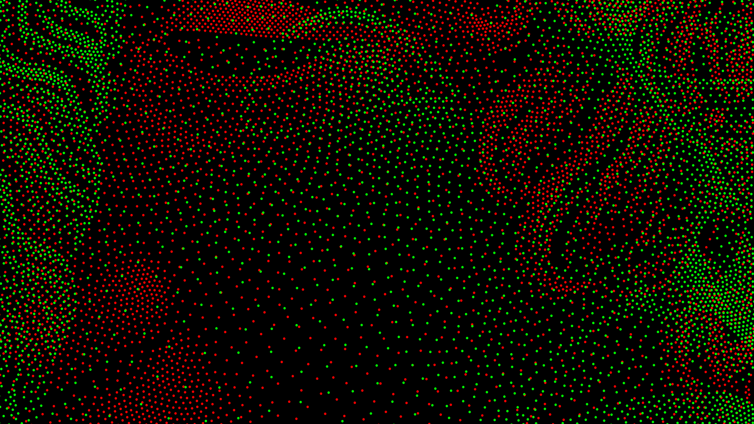
New personal work named Un Segreto
Un Segreto is a new personal series of 3 designs made of green and red dots. Reading the novel The Life of Rossini written by Stendhal, I have discovered the work of his precursor Domenico Cimarosa. I fell in love with his work, especially the opera Il Matrimonio Segreto. The interpretation by Daniel Barenboim & English Chamber Orchestra remained in the pods of my iphone several weeks. And still today it returns regularly. The aerobatic melodies and voices, the candor and the frantic rhythm of the libretto inspired me this series of 3 designs. /
15.10.2021 —
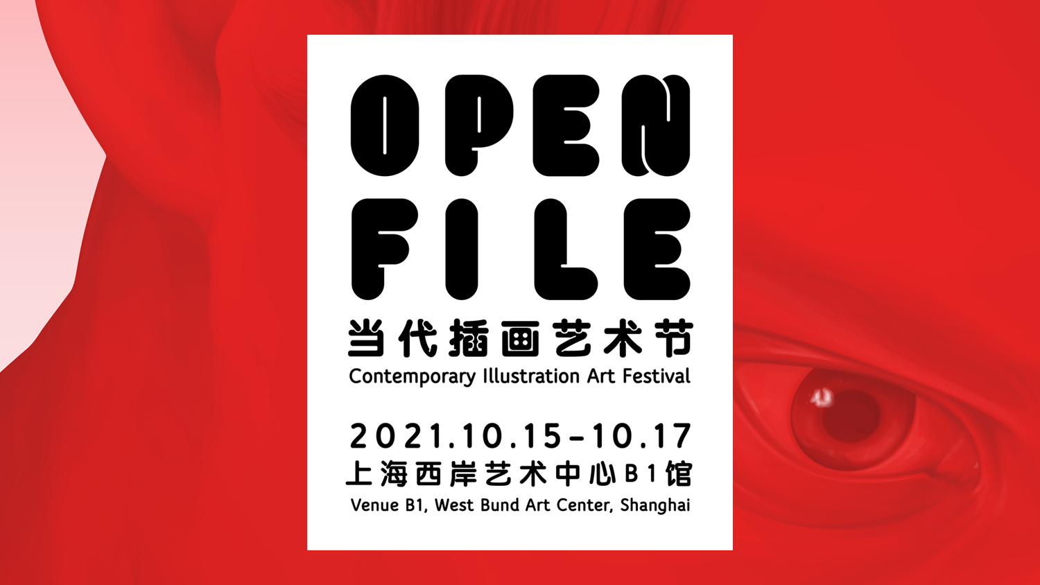
Open Files group show
at West Bund Art center in Shanghai
I am pleased to be part of the group show Open Files, at West Bund Art Center in Shanghai, the 15, 16 and 17 October. Curated by Anouchka van Driel. This will be an occasion to celebrate the wolrd of illustration in all the different forms, from artworks to animations, from installations to toys. For the very first time we will gather together 20 artists from all over the world to give a complete experience to the Chinese audience. Many thanks to Vito Plantamura. /
information here
01.09.2021 —

Oriana’s launch campaign
for Parfums de Marly
Happy to sign the campaign of the new fragance Oriana by Parfums de Marly. I have created a palpably evocative rose palette - a close-up between marble statue and creative photography. Parfums de Marly likes to fuse traditional savoir-faire and technical innovation at the heart of its formulas, so I enjoyed breaking with tradition to combine classicism and modernity. /
10.05.2021 —

In conversation with Vaishali Dinakaran
for 3x3 magazine
Jules Julien likes to conjure up ideas in absolute silence. Once he begins illustrating these ideas using the mouse as an almost organic extension of his hand, he can work with the radio on or while listening to a podcast. Or, as has been necessitated by his husband working from home recently, with headphones and the opera playing as loudly as possible to drown out background noise. He tells me that during this period of time, he was sometimes so moved by the musical theatre gracing his ears that he’d have tears streaming down his cheeks as he worked. The emotions that opera evoked in him also stirred within him a desire to create. The mere desire to create art might make for an unusual starting point for this profile, after all Julien is a prolific illustrator whose work has graced The New York Times, The New Yorker, galleries around the world, and has also been featured in ad campaigns and corporate communication strategies for a multitude of brands. But it’s also the quickest way to reach below the salty waters, tear away the seaweeds, draw to the surface and open up the oyster to reveal the pearl—that Jules Julien is someone who gives himself wholly and completely to creativity and the cycle it involves. (…) /
21.04.2021 —
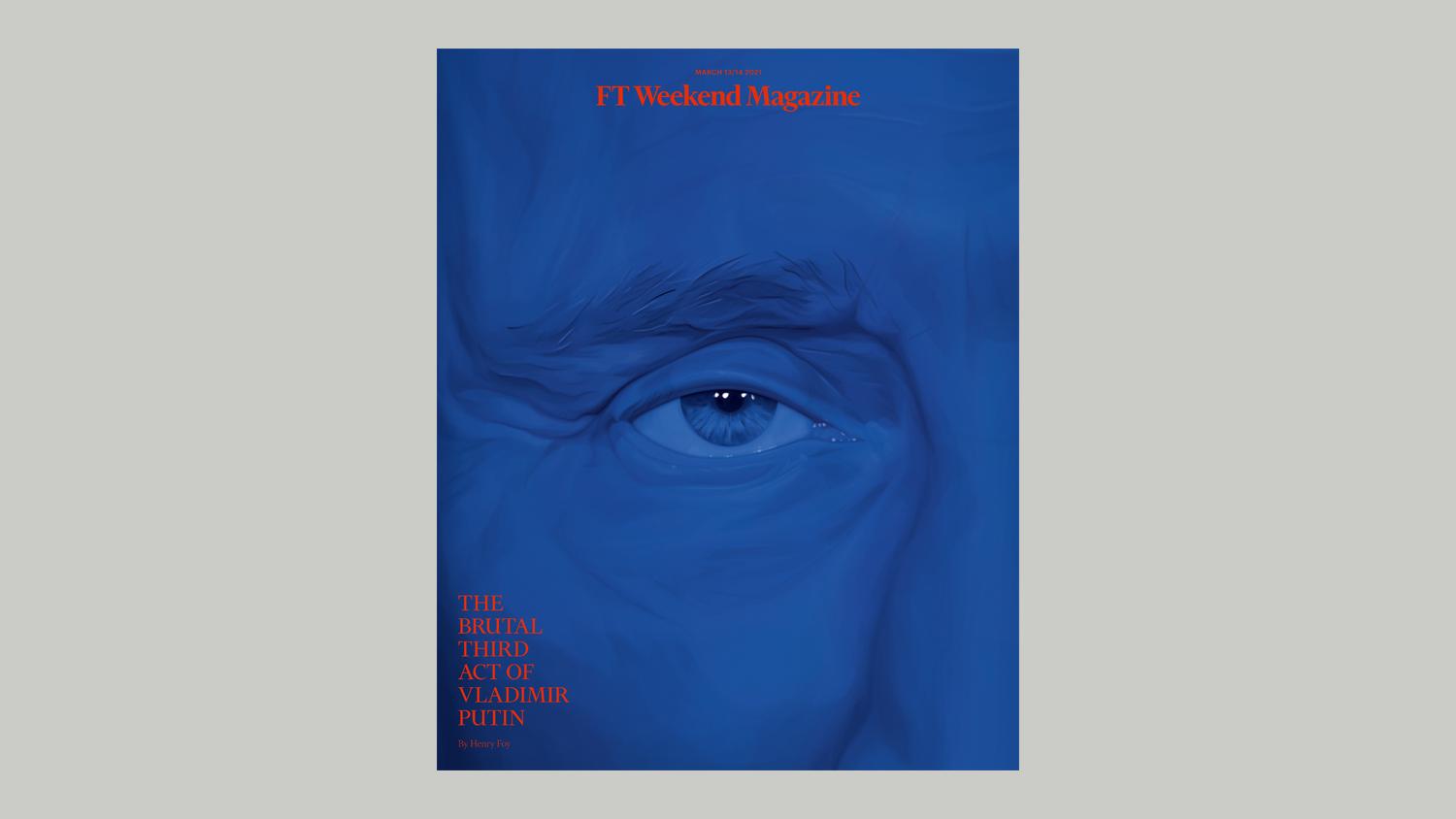
Cover story illustration
for FT weekend Magazine
Out today the new issue of FT Weekend Magazine. I have drawn two portraits of Vladimir Putin, cover and opener, for the story “The Brutal Third Act of Vladimir Putin”. Thank you Shannon Gibson for having me on board with you on this cover story. /
24.03.2021 —

‘Creating is Giving’
Midweek Mentor with It’s Nice That
When first looking at Jules Julien’s dramatic portraits cascading in shades of red, it’s hard to imagine they’re made from code. Zooming into details of a person to accentuate the sensation of privacy, he uses powerful colours, one at a time, to create a surge of force and personality. His latest series Red Glow does exactly this, amplifying the physical form of the human body at the same time. At the end of last year, Jules took us through his fascinating creative process which sees him create his unique portraits using vector software. Through a combination of ones and zeroes, he builds perfectly smooth portraits which can take up to several days to complete. A fascinating digital artist, Jules is this week’s Midweek Mentor, here to share some top tips on staying creatively active and some nuggets of inspiration along the way.
— What aspect of the creative process do you most look forward to and why?
— In my opinion and for my sensibility, the most important aspect in creativity is to make something new and singular. It has to combine the aesthetic and the meaning. I expect from an illustrator, a photographer or an artist to bring me somewhere else, with a unique, unseen and authentic approach. I like feeling a personality behind a series of work. This is the line I try to follow in my personal work. I try to combine the public and intimate, to provide something of me in my series.
— What’s a bad creative habit that you’d like to stop?
— Doubts and questioning too much. I can kill an idea before having started it. But sometimes, an idea can come from the ‘doing’ as much as from the ‘thinking’. I feel bored quickly and I need my job to stimulate me.
— If the pandemic has taught you one positive thing about your creative process, what is it?
— To be honest I really enjoyed the lockdown. My life before the pandemic was not so different from today. I think the pandemic changed the notion of time, less speed, more daily life, less urgency. My work protects me in a kind of way to what is happening outside, like a bean in a pod. I enjoy taking more time to think about my work and what could be an exciting next step.
— What motivates you in the middle of the week?
— I am usually busy working, and often my process takes a long time to achieve. In the middle of the week my motivation is to try to finish on time and to save my weekend from working. I try not to touch my computer during the weekend. I often fail. But I like to work. I am always curious to see the end result of a work in progress.
— Thanks for all this. Now, what are you working on next?
— I am currently working on a series of illustrations for Brand Eins, it is a one year collaboration on four issues. They look more like infographics which I’ve never done before. It is fun to do. I also have a couple of portraits to draw for Philosophie Magazine and Revue XXI, French magazines which I work with regularly. Also, in parallel with this, I am working on a new personal series of drawings called Winter Journey.
— Anything you else you want to share with our readers?
— Creating is giving.
— Who to follow on Instagram?
— Dries Van Noten @driesvannoten - Alex Prager @alexprager - The AIDS Memorial @theaidsmemorial - Jordan Wolfson @jordanmatthewwolfson /
03.01.2021 —

Artworks featured in Zeit Campus
Jan Lichte at Zeit Campus ask me to use some of my red drawings to come with a story in their new issue. The paper is written by Robert Hofmann. The author bullied his classmate. Today he wonders why he was so cruel - and writes him a letter. I feel very invested in this story as I was myself bullied by students during my college years as I was very effeminate. Homophobia starts at school among children. It is by pure chance that my Red Glow series which was designed with the torments of those difficult years in mind finds itself used to accompany the written regrets of an aggressor. Congratulations to Robert Koffmann for your awareness and thanks to Jan Lichte who helped me to close the loop of my own childohood story. /
09.12.2020 —

Portraits for Common Language
by Chantelle
The new issue of Common Language edited by Chantelle is out. I have drawn a few portraits featured in the magazine. Chiho Kanzaki, Chef at the starred restaurant Virtus in Paris, Inès Rau, French model and actress and Alice Pfeiffer, French British fashion journalist. /
22.10.2020 —

In conversation with Lucy Bourton
for It’s Nice That
As you can probably tell by looking at Jules Julien’s most recent series, colour is hugely important and influential in his artistic practice. A series of highly detailed illustrations, each made using vector software, Jules’ eye builds up portraits in cascading palettes of red. “I have been a bit obsessed with colour for a while,” admits the French illustrator.
Working as an art director for over decade – until “I was disturbed by the purpose of this work: consumption” – Jules made the decision to spend his time with “my favourite activity, creating with no other purpose than my own work and pleasure,” he says. After this bold move, luck (and hard work) appears to be on the now-illustrator’s side, as a year since making this decision, Jules is busier than ever, working on illustration commissions alongside personal pieces.
The most recent of which is Red Glow, a personal project which feels aptly representative of the attention to detail that appears across the illustrator’s portfolio. In what Jules himself describes as “minimal and emotional at the same time,” the creative often finds himself working with only one colour, each having “its own force and personality”. Utilising one colour’s palette to focus heavily on a person or object in a series, Jules’ work will often zoom into “details or tight shots where there is no action or movement,” he tells It’s Nice That. In turn this communicates “A close up view on people to accentuate the sensation of privacy,” for example, also highlighting other qualities such as “their sensuality, their beauty and the power of their skin”. The result are pieces which almost look like “marble statues” as Jules describes, following his aim to “praise the beauty of the human body.” (…) /
read the full interview here
01.07.2020 —

Black Lives Matter
art prints with Hugo & Marie
Following the murder of George Floyd during his arrest by several police officers, Hugo and Marie had the great initiative to invite the artists of the agency to create art prints in support of the Black Lives Matter movement. The proceeds from the sales will be donated to associations supporting the African American community. I have created a series of 3 designs showing the vigilant gaze of an African American woman drawn using multicolored dots. To question the role of color in humanity. /
21.06.2020 —

Fashion illustrations for Revue magazine
Revue magazine invited me in their new issue to draw fashion visuals to come with a text named Une couture sans Couture. The text written by Lucas Marchetti attempts to analyse how the world couture creating surprises using theatrical gesture. The text focuses on the example of seamless clothes made brand brands like Comme des garçons, Uniqlo and Issey Miyake. Thank you Justin Morin and Simon Rivero for your invitation to collaborate with you on this story. /
12.05.2020 —

Editorial illustrations for Brand Eins
Britta Max, creative director at Brand Eins, commissioned me to take over the cover stories for one year of all the issues of the magazine. Using a simple line for drawing and bold colored gradients for the backgrounds, I have worked to express the concepts evoked over the pages of each story. It was a very playful and dynamic to try to reflect our crazy world on these series while keeping in mind the motto Less is More. Thank you Britta for this year of together. /
view the series here
17.04.2020 —

Cover artwork for Apple music
Apple music requested me to work on visuals to embody the R&B playlist on their streaming music platform. After many directions, I have worked on these immersive blue portraits. Using a minimal palette of deep blue and black I have tried to express the mental as well as the physical benefit that music provides within us. Thank you Kristin Eddington and Jenny Barnes for this great collaboration. /
21.03.2020 —

Portfolio in Mirror Mirror magazine
Georgette Koning, the editor-in-chief of Mirror Mirror, a quarterly Dutch fashion magazine, invited me for an interview and the publication of an extract from my portfolio. I am very touched by her invitation which makes me feeling a little bit more at home in the Netherlands a few years after my installation in Amsterdam. The magazine is designed by …,staat Amsterdam which is one of my favorite Dutch design agency. Georgette titled her interview Echt Mysterieus which corresponds well to the intensity that I try to give in my work. Hartelijk dankje Georgette. /
10.01.2020 —

Portraits for The New York Times
The New York Times commissioned me to draw the portraits of all the candidates for the 2020 US Democratic Party presidential primaries to come with a special issue named The Choice. Working with Franc Augugliaro, design director at The New York Times Opinion we have been looking for a soft and vibrating color palette around the blue of the Democrats. The Aims of the work is to present the candidates at the same level while expressing the diversity of the profiles of each. Thank you Franc for working with me again on this new project and for your trust in my work. /
14.09.2019 —
Tokyodam, new collages
between Tokyo and Amsterdam
Coming back from Tokyo to Amsterdam, I created these two collages, my mind still traveling between the two cities. The faces are drawn by sticking white and red pearls one by one. Printed on glossy photo paper, the prints are encapsulated in two plexiglass plates of 10mm and 5mm thickness. Size is 3000 mm x 400 mm, edition of 3, handsigned and numbered. /
22.06.2019 —

Fort Contemporain
group show
Glad to participate in a new group show curated by Mathias Courtet and Mathieu Grandet named Fort Contemporain. It will take place from the 22nd of June to the 6th of October 2019. The exhibition is a way to inscribe the castle in another time and another dimension and to obtain an alchemy between an old building and a contemporary collection. /
12.04.2019 —

Colour Stories
artwork for Mayday magazine
I have been invited to create of piece focusing on the color blue. The drawing comes with a text written by Angela Wright who is colour psychologist and colour consultant at Colour Affects. The text named International Klein Blue and Colour Psychology analyses the exploration of this colour by artist and its impact since then on fashion, art, architecture and popular culture. A print in limited edition is available on their website. /
03.02.2019 —

Collateral on Netflix
collages for the Atlantic Re:Think
I have worked with The Atlantic Re:Think Original on two pieces of collage for a new TV Show on Netflix named Collateral. The series highlights the hope that women could represent if it took over our institutions instead of men. ‘With public’s faith at in organizations at historic lows around the world, women may hold the key to rebuilding that trust’s. /
25.11.2018 —

Essence Naturelle
group show
Nice to be part to the group show Essence Naturelle curated by Mathias Courtet in Laval, France. Itwill take place from the 25th of November 2018 to the 6th of January 2019. The exhibition is a mix of pieces from the science museum of Laval in France and a selection contemporary pieces of art. Thank you Mathias for having me on board of this small exhibition! /
01.11.2018 —

Cover story illustrations
for The New York Times Magazine
Honored to be featured on the New York Times Magazine cover of this month. I have worked with their team on a cover story named Secrets & Genes. The story written by Ruth Padawer explores the surge in popularity of services like 23ANDME and ANCESTRY means more and more people are unearthing long-buried connections and surprises in their ancestry. Thank you Deb Bishop for having me with you on board for this issue. /
©julesjulien 2025